Hey guys, welcome back and happy Wednesday! I wanted to hop on here really quickly to tell you a little something. I am excited to show you guys what I have done today. I have created a logo for our episodic documentary! This is something that we will mostly use in our social media and other places if needed. The process of making this logo has not been easy. I went through many different options and made around 10 other logos before finding this one. Honestly, the journey was a rollercoaster of creativity and persistence.
Crafting this logo wasn't just about drawing shapes and playing with colors. It was a deep dive into the essence of our documentary series – what we stand for, the emotions we want to evoke, and how we want to be remembered.
The colors we've chosen aren't just visually striking; they're symbolic. We used the colors blue and white. We did this because Javier's company logo uses those colors as well. Below, you can see an image of Javier's company so you can see yourself:
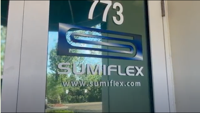
This picture you see is of the door of Javier's office.
As for the font, it was a decision that took as much thought as the content itself. We needed something that resonated with our documentary's tone – strong but approachable. After experimenting with over fifteen fonts, we found the perfect match.
Now that you read the basics and the reasons behind our logo, you can finally see the finished result. Here you go!

I really like this logo and I feel like it represents the documentary very well and I hope you do too. Anyway, that's all for today but stay tuned, because this is just the beginning. Catch you next time!


No comments:
Post a Comment